Thursday 27 May 2010

OUGD203 Evaluation

This brief has been my defining moment on the course thus far, not only have I felt confident with what I am doing for the first time on the course, but I am designing for passion for another interest of mine as well as gaining new knowledge and skills.

This module has given me the drive and focus I needed so badly in the earlier days of the course, with my added skill points bestowed upon me from Anthony - which to be honest was the key thing learnt from the collaboration: time management. Rather than try to just get by not knowing what day it is, what is timetabled, and not planning appropriately left me in more than a few sticky situations looking and being useless. Since the collaboration, I have managed to better structure my time, allowing for a balance of work and play which has given me a confidence boost, given me more sleep, which has, overall benefited me much more as an individual and a designer.

The initial research was quite fun to do - as well as being informative to the design work - since it was all directed at a subject I already know a great deal about,but had to collect and collate opinions from a broader context, which/who turned out to be the people I was aiming my products at. If I had not found out about Ashley Browning, I would of not gained the inspiration to use the full garment as a piece of illustration, so undoubtedly, if my contextual research had not been done, this entire project would of been a colossal failure.

Since I was working with my own set of skills, abilities and knowledge prior to the brief, it became much easier to plan out and know what was achievable by when and how. The digital side of my project was something that I was quite confident with at first, especially at the prospect of designing, developing and proposing the website which turned out to take alot more time than first expected. I would of really liked to actually make the website in Dreamweaver for submission, but knew that with my lack of proficiency with the software, I would of wasted alot more time trying to make it than actually making the website. Although now hand-in is over, I would really like to make this real, I have had alot of interest from friends in the work produced which not only gives strength to the project, but also the effective design gone into the site and clothing respectively.

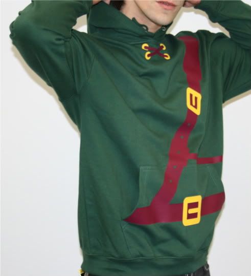
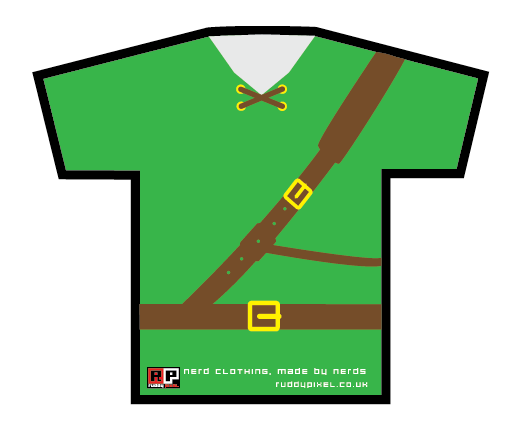
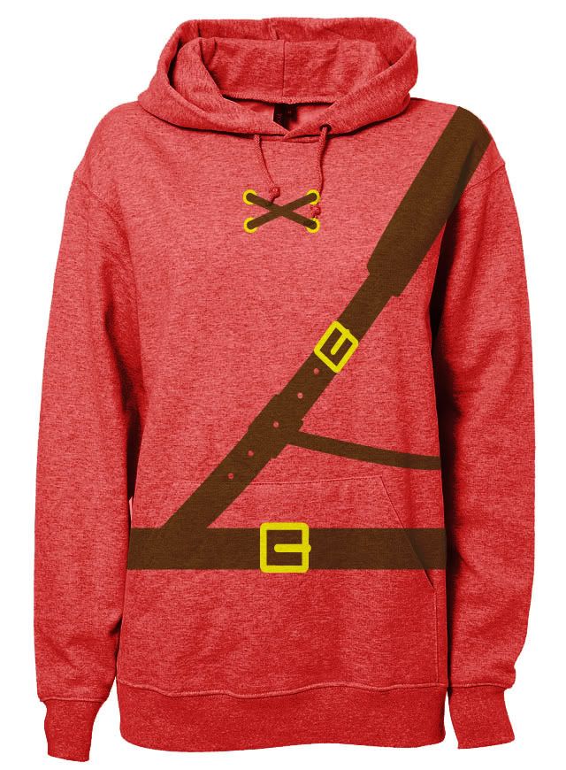
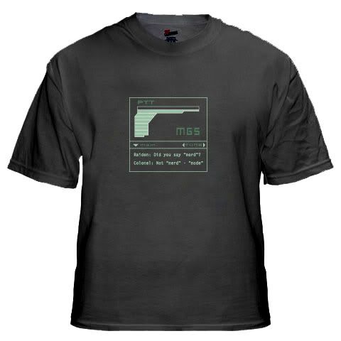
The physical products themselves were not exactly what I wanted, due to the printing place being arther limited in terms of colour choices, hoodie colours, and me not having enough money to buy more as to have 3 fully finished, boxed products. I decided not to screen print them, as it did not fit in with the clinical style of the illustrations, and could of jeopardised the look of the clothing, as well as costing me precious hours in the print room. I was impressed by the feedback at the crit though, despite the Metal Gear t-shirt being 3 colours wrong, overprinted and irritatingly inaccurate, it was obvious the main success was the Link hoodie, my choice of the bottle green hoodie with the burgundy and sunflower yellow seemed to work well with each other.

The packaging for the clothing was of a relatively high standard, although if I had planned it and researched it I could of gone somewhere to get my designs printed on real cardboard, but would of probably cost me a fortune for just two of them, let alone three. I did not screen print the boxes, since the illustrations would of been bent due to the nature of making the boxes after they had printed, but Im happy with the outcome regardless.


The one thing I think that may have an impact on my grade is the lack of physical development work since alot of my work was digitally produced and developed on screen as opposed to alot of post production sketches and visualisation. The main reason for this is because the main body of work was to be produced for screen instead of print, which I have tried to make clear throughout the project, with the exception of the boards, products and packaging, so hopefully in this respect the reason for not having as much development work is justified. The most successful in development terms was the website, as the main body of illustrations was generated, it was only a matter of refining the initial ideas down, but whereas the website has evolved over the entirety of the brief, being adjusted according to the critical review during the timetabled sessions.


Another main improvement that I have started to demonstrate on this brief alongside being much better organised, is the ability to record and document all aspects of the project, instead of being lazy and thinking about blogging it later on, I have managed to keep on top of the posting, which has greatly benefitted me, allowing to make better decisions and design to a much higher standard by means of much better critical analysis.


Things I will do differently:


Blogger - 


Try to keep my blog up to date, but keep it tidier, with less scattered posts, more critical evaluation and learn the basic HTML I need to be able to keep everything aligned and the right size.


Context - 


I think that I needed alot more external sources, more critical links to my work rather than relying on the knowledge I had in my head as to ensure my work is well informed and contextualised enough.


Production - 


I think instead of all the proposals I could of done alot more mocking up and making physical objects, since alot of the time my work was just print outs on sheets of A paper.


Attendance 4
Punctuality 3
Motivation 5
Commitment 3
Quantity of work produced 3
Quality of work produced 4
Contribution to the group 5

Hovis Boards - Illustrator

FMP Boards


Open publication - Free publishing - More vectors

These are the final boards for submission, albeit a tad on the light side in information and images, but I wanted a decent balance of the two, as well as the majority of everything I have done for this project has gone straight onto my blog.
It shows mainly the final developments and final products, as I have been doing the occasional issuu post where progress can be seen online. Unfortunately, due to a lack of pence on my behalf, I have opted out and gone for the two A3 stuck to an A2 board approach (but managed to give Alex in the 3rd year my print slot) which means that they look, well a bit shit.

One main thing I realise is the body text is way too large, but it was because I thought that it was quite a hard typeface to read in terms of legibility.
Another irritant was trying to print these equally on the mac suite printers. I decided that copy and pasting the illustrator files into photoshop and printing them half and half would work well. Maybe not. Nonetheless, I cropped them down, and constructed them to the best of my ability. The first time on this course - and ever - Im on time, and not stressing out.

Wednesday 26 May 2010

Product Shots


Final Website

After losing my website files, as well as the supporting assets to make them, I managed to redo it today! I even managed to make it better...


Tuesday 25 May 2010

Product Shots - not photoshopped

The two final T shirts I picked up from the shop in the Merrion centre.
Was majorly pissed off to find out that they had messed up the print on the MGS t-shirt, you can't really tell in these photos, but in its physical form, there is so much overprint it makes you want to burn it. On the other hand, the Link hoodie came out incredibly well and I think I will be making another one with the master sword on the back as included in my proposals.


Final Crit


Main points from Mille and Kate:

  • Clear design direction; good evidence of design process and have tested alot of different ideas. 
  • Annotation is evident and demonstrates my decision making considering the design work.
  • Can see this existing in the 'real world' market, high quality and suitable for the audience.
  • everything clearly presented and design direction clear throughout.


Overall, the most successful final crit of the course, lots of positive and constructive feedback.

Main points from Lauren, Will and Ollie were:

  • The blog is clear, easy to follow, and demonstrates my creative flow/thought process throughout the project. This applies to both context and practice, overall everything is really clear and makes sense.
  • Make sure everything is tagged and double check the level and quality of the annotation
  • Boards: no need for an impact board, but rather an overview of my brief, with some relevant development work. Products in context.
  • Need to retake the product shots, or just photoshop them to look more crisp and show off the products themselves. Try to keep the boards in some sort of uniformity (see clarity of boards)
  • Website looks great on screen, not so good in print.


Action Plan:


  1. Viral campaign photos
  2. Product shots
  3. Website
  4. Boards finished 
  5. Update blog

Monday 24 May 2010

Viral Campaign

So I went guerilla stickering around town today, and took a point and click with me, thought it would do the job, but as you can see they have come out terribly. I was going to stick around and get a better picture, but after gingerly skulking around the shops I had stickered outside, I was put off taking anymore. As a result  they are poor quality so Ill have to take them again.


Sunday 23 May 2010

Evaluation

Working in a collaboration the second time around has been more than a challenge. Anthony has been incredibly efficient in time management, and has showed me the best way to keep on top of things, by making notes and lists, planning out on iCal or on my phone, then ticking off my to do lists.

Now time management is all well and good when work is produced, decisions are being made, as well as the pair working as a pair, not being as distant as an ex at a wedding.
I did learn that I am incredibly submissive and far too polite, allowing him to walk all over me, but this was not due to me being intimidated by him, but more of the reason that he would not agree until you at least compromise with what he wanted to do, or just agree, be it a type decision (which with his sole responsibility of this area, became VERY particular about it and allowed no conferring) layout (again, ego takes over) or even any image related decisions.

Taking the tone of the elder, more powerful one in the collaboration, he often spoke down to me, making a plethora of snide comments, rude remarks and being extremely patronising on more than one occasion in a week. It was quite hard to come to any sort of conclusion or decision with Anthony, and found that the conversation tended to loop back around which was the real thorn in the side of the project.

Overall I know I should never say this, but it feels like I wasted alot of credits thanks to the selfishness of Anthony, especially concerning his ties with Germany, his patronising, bitter personality, and not to mention his lack of decision making and input.
It was as draining as it was tiring, I feel like I could of had a decent piece of work, but instead I had a headache, ballache and a pisstake in the collaboration, and yet I only have myself to blame.

Thursday 20 May 2010

Logo Adjustment


I forgot to post this earlier, which means this could harm the direction assessment criteria, but the logo had to be changed due to the website using black, and also the application to the labels on the clothes themselves.

Viral Stickers


These are the final viral stickers that I will be placing around Leeds, but will be distributed nationwide outside game stores and clothes stores alike. By using a mixture of my own imagery and icons from the games themselves, I aim to encapture and intrigue the target audience by using simple, bold images that are easily identifiable with the game.

Wednesday 19 May 2010