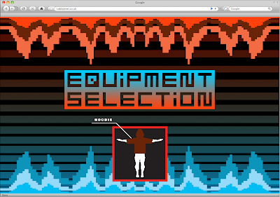
These first 3 screenshots are mean to depict how the intro to the site's splashpage would open. The bars in the background would already be there, with the 8bit mountain range creeping in from both top and bottom. I prefer the type on this set of designs, as it is easier to align and fill. That aside, it could relate to a plethora of primitive games, rather than trying to reference specific games to suit the audience, this one seemed to suit a sweeping generalisation within my demographic.
Customers will have to literally press start for the site to open.
Instead of having the logo in the first few screens, they will be used as the selection highlighters, which means that the logo is iconic instantaneously, and upon selection the 2 letters then close the box up, hiding the type which then leads the customer on to a very brief loading screen.
A riddle bit of engrish here


No comments:
Post a Comment