Monday, 24 October 2011

More Focus, Different Direction


Did a mindmap of different elements that I would have to consider when addressing something as large as an exhibition space. At this stage I wanted to outline various elements that would be essential to an exhibition of the various Heroes I had chosen, whilst fitting the criteria of the intended audience. Obviously people who work within the education of, researching of, archiving of and practitioners of their specialised field. This gives me some flexibility of what sort of terminology I can use, as well as the overall tone of the information which I believe to be casual but informative, since the brief is for those who read New Scientist, write for Discover magazine or contribute to scientific articles. Their styles are often written in a casual tone with an undertone of intellectual skepticism.

I outlined 2 sorts of restrictions/templates to stick to in preparation for next weeks crit to make sure I don't get lost in the brief and have some restrictions to work to. 

Information Template

This is the information that will be used in the exhibition space, limiting and setting restrictions will allow me to start designing almost straight away.

  • Mini Biography - To establish who the person is, gives the viewer an insight into what sort of person/background the individual came from, including any odd facts about the Hero.
  • Main Achievements - These include discoveries, inventions, collaborations and forward thinking.
  • Main contributions to science - A spillover from Main Achievements, how their specific practices revolutionised the mindset of said practice.
  • Relations to Modern Living - How their work has effected the minds and lives of people today.

Design Template

This is the restrictions/deliverables I have set myself in preparation for next week. All main decisions should be made by the mid week.

  • Signage - The signs used to navigate around the exhibition space.
  • 4 Walls - Each Hero gets four walls to display their information
  • Colour Coded Areas
  • Clean Infographics, Vectors and clinical type
  • Mocks from photos of S4 or any exhibition space relative to context.


So, what I need to do now is to research the information of each Hero, then start looking at the various options available visually and how to apply them to said space. Dimensions of space and also the presentation of information will be essential.

Tuesday, 18 October 2011

Poster Development

I was relatively happy with the first design I did, but I figured it might be worth trying out some other ideas as well as tweaking the original design to see if I could get any better results. I have had some interest and good feedback from the first set of posters, so I would be interested to see the feedback from the crit on this next set.


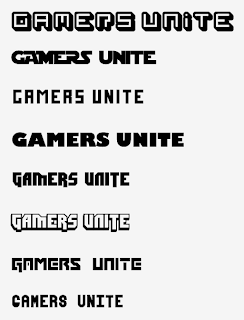
Thought I would start by tweaking the original, not out of laziness, but I wanted to challenge the composition of the poster and try to get something out of it I know is there. Mainly the type choice which I thought was perfect for it, but became apparent after a few more downloads from dafont as well as some casual experimentation with stroke/fills that it was not the only choice.
The colours I used I wanted to keep as it is a striking combination that people look at and have their attentions stolen which is exactly what I wanted it to do. The imagery used in the centre was something I also wanted to challenge as I know that I hate drawing hands be it with a pen or the pen tool. SO a clenched fist a la revolution was the next obvious step forward.


I had had enough by this point and all I wanted to do was start working with and looking at the type element within the composition. The new format appeared to look less lazy and more thoughtful (which it was!) as I fiddled with the points of the lines I was using as well as using different strokes to see what sort of results came out of it. I didnt like the spots instead of lines, as it detracted away from some of the key elements such as the vectored control pad spheres, the excess of stroke on the GAMERS UNITE at the bottom of the poster, but the overuse of the hands made itself useful as the whole point of this brief is to get together and play.


Fonts (in order) 

  • Absender
  • XLMono Alt Regular
  • Dimitri
  • Spleen Machine
  • Star Jedi


Fonts (in order) 

  • Alegre Sans
  • DOCK heavy 11
  • Futura Extrabold Condensed
  • Orator STD slanted
  • Future Millenium 


Fonts (in order) 

  • Spleen Machine
  • Star Jedi Special
  • Future Millenium 
  • Orator STD slanted
  • Millenium 


The next logical step was to start playing around with the text at the bottom and how the colour options would effect its visual effect/legibility/readability as well as its relation to the rest of the image as a whole.
I really am warming to the use of Dimitri as the predominant typeface as it is more gamer related, has more weight which the drop shadow gracefully emphasises and looks sweet in just about every sort of variation I try.


So finally, I put to use the experiments I was doing in type and colour with these final-ish poster designs. Think they are much better in terms of composition, colour, type and fundamentally as a piece of design that functions as well having some form of aesthetic merit that holds true to the brief and the intended audience. The subtle use of gamer spiel with added RPG-esque rhyming riddle makes it more like a finished design. MAYBE screen print next week?


Hand Type and Illustration

Since the crit I have been working on nerd related illustrations of characters in a simplistic style as is the nature of the initial poster design as well as the overarching concept of the brief. I wanted to do a series of sketchy hand drawn, pen ink and then purely vector merchandise designs, but after doing a few rough drawings of characters I started sketching out rough type ideas to take further as it seemed like a viable option and had some good starting points in terms of further development. 


Admittedly it was a bit late at night, but I was running out of ideas pretty quick and I had not really done much hand type even though I really do enjoy it as it is a much more interesting take on the practice of type.


Admittedly they seem rather weak at the moment, but since I am moving into a new house tomorrow I figured that it would be a good idea to get a sample of work to show what direction Im taking visually.I also think they work quite well as collective images or as separate entities.


So I started messing around with colour and how they might look printed, suffice to say, I hate live trace. Also a good idea would be to develop them further and draw them larger next time to avoid it losing some of its visual impact. 
I will be looking at how to better develop this idea and put it into some form of sellable merchandise.


Screenprinting

This year I proposed in my design strategy that I wanted to have more experience in a print workshop by getting back into the process of screen printing. Although the process is often lengthy and can cause some unforeseen circumstances such as a print gone wrong or misalignment when getting the registration setup, I figured the best time to do this would be this week, so I can continue trying and testing into reading week.

I initially wanted to do some work that is not to do with my practice in relation to the course as to get used to the actual physical process without the hindrance of inexperience causing me distress on some professional work in context with one of my briefs. 
My friend Matty from Harrogate has started his own zine on discordianism which he wanted contributors to provide the content, since the aim of the magazine is to get out peoples opinions on world issues, personal issues or whatever it is that they wish to write about in the spirit of discordianism. I decided that I would be interested in providing some illustrations for the zine, as it will keep up my own individual practice and presentation concerning that particular aspect of my work. 


This is the original image I created, using the object of order for the primary image, including the archaic symbol of chaos for the main focus of the piece. The scroll is meant to be compositionally not symmetrical because the principles of discordianism are skewed and often misinterpreted by those who do not understand. The insignia which may appear crude is merely toying with the fundamental aspects of life: sex, death and social interactions/turmoil. Although I am treating this analysis as if it were a piece of art I feel it is only necessary to justify the uses of said symbology and gives me a light practice for similar critiques when applying it to my dissertation.
The addition of text was necessary as Matty said that I would have to produce the text myself, as he didnt think the type guy working on the zine would have the appropriate skills to match the style of the image which only seemed fair. All I did was look up the main constituency of people that were involved with discordianism and then drew out some simple lettering that would go with the illustration.


I started messing around with colour, and how the printed outcome may look, but then after realising that for a few first prints in over 2 years, maybe 3/4 colours is a little overambitious. So I opted out and went for a combination of key black with one of the primary print process colours, in this case I went with cyan, as it met my needs for a semi dark uniform image, as magenta and yellow looked too bright and vivid to compliment the origins of the illustration.
I have already washed my screens and will be exposing them this afternoon so I can print on Friday morning with Paul, who has also taken an interest in the print process.
Im making T-shirts for the main reason that I will be printing on fabric alot for the GamesAid brief as well as my own self-directed and brief-related promotional materials, so it makes sense to get this done as a practice run.


Thursday, 13 October 2011

Tutorial with Fred

Actually went surprisingly well considering I thought I was a bit behind in terms of blogging, research and development, however this was not the case. 
We looked at the PDF's I had made regarding my progress on the briefs and overall the feedback was incredibly positive. 


Heroes of Science


My questions: 


- Do I need to worry about the deliverables changing as I progress?
- What else can I do with this brief?


Basically the visuals I had produced were a good start in terms of direction, as well as having a clear context both in deliverables and what I was looking into.
I didnt take into account what Fred said last week however, about having a larger scope on what I could produce and trying to be ambitious creatively, although this wasnt a direct criticism it did give me some inspiration in terms of where and what I could apply my work to.
He also mentioned that if it was going to go on an exhibition I should seriously consider the space that is available, such as wayfinding graphics to direct someone to each room that is assigned to each hero. Infographics on the individuals achievements, large scale images that could potentially dwarf someone in the room or even some form of projection. 
Thinking a bit more ambitiously and big. To dwarf the competition obviously.


Time Thief


My Questions:


- Could I rewrite the brief to suit my needs?
- Should I produce a range of possible outcomes?


I didnt actually have any visuals for Time Thief as it is currently on a backburner for the time being, but I was having problems coming up with something that was a little more abstract than what the brief had to offer.
Fred said that in order to get the most out of this brief then what I had to really do is challenge the aesthetics of the game entirely since the brief is no longer live I could have creative freedom.
For example trying to come from a designers point of view, instead of the brown/green/black realism the majority of games offer at the moment bring it back for the Graphic Designers instead of the Game Designers. Things like mosaic in a roman level or using only hand drawn sketchy looking graphics, with notes and research notes taking the forefront or just putting it down to a text input style game so the theme of the game is intact with a complete esoteric feel to it rather than the norm of game design. 


Games Aid


I kind of knew where I wanted to go with this brief so I didnt ask specific questions, instead I just opened a discussion so I could find out how I could take this further than what it was, without letting it spiral out of control.
Essentially all I have to do is develop a whole range of posters, t-shirt graphics and trying out a range of illustration techniques, even considering using sketchy/pen and pencil drawings to apply to the designs. This enables that I produce and develop enough to get a more concentrated range that will establish some portfolio worthy work. 
11/11/11 is the magic number so I should try attach the number to a series of designs I do. 
So as a conclusion, I need to design a whole load more posters and t shirt ideas to see what is going to work and what isnt. 


Manual of Unconventional Weaponry


Once again I just wanted to open a discussion on this brief so I could try get a better idea of what it is I want to get out of the brief.
Basically I had only started research on this brief as it will probably turn out to be a brief of significant magnitude if I dont take hold of the reins now. All we discussed is the content, not letting it consume me, and allowing time to categorise about 10 weapons in each section as well as visualise the double page spreads without the worry of production just yet as Fred did say this year is a 'Marathon not a race'. So emphasis on the design of the book as it will take up a considerable amount of time without the worry of production since it will take much more time than just designing it, so I could come back to it at a later date and make something that could be bookstore worthy.
Thinking of potential PoS in waterstones, or how the promotional material like a infographic/timeline of the weapons and how it would sit in a real world context.


As for the book brief, he was happy with what I was producing and with that, I need to finish it off!


Wednesday, 12 October 2011

So far....

Not very neat as I decided to do this last minute, as it would be easier trawling through a blog as most of my work is scattered at the moment... Figured it would be a much more accessible point of reference.

Open publication - Free publishing - More heroes


Heroes of Science

- A set of magazine covers as 5x A3 CMYK prints in context, 5x A2 Screenprints
- Imagery based upon the subject's specialism/invention
- Gaining knowledge of contemporary science

+ A set of prints that can be sold or transferred onto another medium like t shirts and be sold for my own personal profit
+ Screenprints to be proud of, and some illustration that I can put in my portfolio


Audience/Tone

18-45yr olds who read regularly about science, world events, current affairs. Papers like The Times, Guardian, Telegraph and magazines like New Scientist.
Mainly lower-higher middle class as well as lower upper class. Have a thing for new ideas and can be swayed by an image. Tongue in cheek, sarcasm, black humour and a blunt sort of tone would suit this audience best.


Games Aid

- A series of A2 posters 
- Promotional stickers, packaging, prints
- Press pack that is a PDF

+ Organisational skills that could lead into potential collaborations in both professional practice and industry
+ A delivery solution presented to a high standard
+ A print that will be seen, used and distributed by people all over the UK

Audience/Tone

14-30 yr old gamers, have a knowledge of contemporary games, as well as some knowledge on some of the older titles. They read magazines like PSM, OXM, Games Master and Nintendo Magazine as well as thriving in stores like Gamestation, GAME and CeX. Range of classes, as more or less anyone can afford a console in some form. Mainly appealing to the younger audience as they are more likely to be able to get time off to play on the appointed days. Tone should aim to be sarcastic, dry, with a form of humour best described as nerd humour.


Manual of Unconventional Weaponry

- Bound book in full CMYK
- A2/A1 Print of all weapons used in the book

+ A good looking publication with no real flaws. For once.
+ An installation of some kind
+ Paper toy gun

Audience/Tone

18-25yr old gamers, students and nerds, have an extensive knowledge of gaming history and have clear memories of playing some of the classic titles. They thrive on critic's opinions in gaming magazines and on websites like the escapist. The tone of voice should be relatively witty, formally structured but delivered with an air of pompous sarcasm.

Time Thief

- 5x Screenshots of game
- A2 print of cover
- Sleeve design
- Advertising in context

+ An esoteric interpretation of what a game is, stripping away traditional notions of gaming through a innovative smartphone game.

Audience/Tone

16-25yr old smartphone users. Have grown bored of resurgence of games that plague the nation, eg tower defense, catapult, puzzle etc. Have played games like Robotek HD, Plants vs Zombies, Geometry Wars and DeeC. Tone should be casual yet informed and funny like GLaDOS.


Tuesday, 11 October 2011

Games Aid

An incredible progression has occurred today involving Rosemarie and Claire from GamesAid UK. I asked them if I could promote an event that could be undertaken on the date Skyrim is released, as it would not only sate the nerds who have waited what feels like a lifetime for the game to come out (me included) but gives the gamers an opportunity to give something back whilst having a literal session, be it by themselves or with other people. 
Im not limiting the gameplay that takes place on that date strictly to Skyrim, no I wholly endorse the multiplayer/tournament aspects of videogames, and actively encourage people to get together and have a good time raising money. I am not creating an event but I am promoting the good work that GamesAid do and hoping others could take a day out of their lives to do something they enjoy for other people who enjoy gaming but cant engage with a controller in the same way. Gaming for gaming sake.
The way I have this out in my head is that I have almost finished putting together a PDF that is essentially a mini press pack; poster, info, sponsor form. This enables everyone to take part having things to take promote whatever they are doing. The PDF will also outline that the participants are encouraged to take photos and post them on the facebook group, hopefully beginning a landslide of game related charity events in the future.


Moving on, here are some initial development and poster designs.


Funnily enough, I am using this poster for the Book Fair in Manchester as well, as its versatile enough to fit in with both briefs.


Some central piece work, not a rebrand as such, just an excuse to have an aesthetic yet functional imagery that has some impact on the audience.


So I was being a bit cheeky here, going straight from my initial poster/concept ideas onto the computer which normally takes 3 days to transfer my ideas to a cohesive deliverable. But no I had a great feeling that this brief would produce some viable results. Especially since that the audience is just nerds like me, but the only difference is that parents who looked down upon video games may find solace that games can be applied to a purely positive means.
I ticked various posters that I was going to develop, it was going to be 3, but after starting visuals it became apparent that I had so much potential as using them in part of a series or trying to establish some solid visuals for the brief. The colours I used are from the logo which I wanted to keep as it would keep some sort of correlation between the charity and my event.


Personally I REALLY like this poster design, it obviously has further potential in terms of digital development and is begging to be screen printed, which may have been my intention. Well it wasnt, at first I presumed this project to be printed professionally down with James on some well selected substrate but no, I really am starting to get attached to this design and think it would look ace as a print.
I think it does serve its purpose rather well, as it focuses on no singular game, and the inclusion of the majority of gamers (PC, arcade, Wii, Sony, Nintendo, Steam etc) it could have a mass appeal. Time will tell as I have posted this preliminary design to facebook for the group just started today.