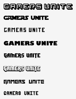
Thought I would start by tweaking the original, not out of laziness, but I wanted to challenge the composition of the poster and try to get something out of it I know is there. Mainly the type choice which I thought was perfect for it, but became apparent after a few more downloads from dafont as well as some casual experimentation with stroke/fills that it was not the only choice.
The colours I used I wanted to keep as it is a striking combination that people look at and have their attentions stolen which is exactly what I wanted it to do. The imagery used in the centre was something I also wanted to challenge as I know that I hate drawing hands be it with a pen or the pen tool. SO a clenched fist a la revolution was the next obvious step forward.
I had had enough by this point and all I wanted to do was start working with and looking at the type element within the composition. The new format appeared to look less lazy and more thoughtful (which it was!) as I fiddled with the points of the lines I was using as well as using different strokes to see what sort of results came out of it. I didnt like the spots instead of lines, as it detracted away from some of the key elements such as the vectored control pad spheres, the excess of stroke on the GAMERS UNITE at the bottom of the poster, but the overuse of the hands made itself useful as the whole point of this brief is to get together and play.
Fonts (in order)
- Absender
- XLMono Alt Regular
- Dimitri
- Spleen Machine
- Star Jedi
Fonts (in order)
- Alegre Sans
- DOCK heavy 11
- Futura Extrabold Condensed
- Orator STD slanted
- Future Millenium
Fonts (in order)
- Spleen Machine
- Star Jedi Special
- Future Millenium
- Orator STD slanted
- Millenium
The next logical step was to start playing around with the text at the bottom and how the colour options would effect its visual effect/legibility/readability as well as its relation to the rest of the image as a whole.
I really am warming to the use of Dimitri as the predominant typeface as it is more gamer related, has more weight which the drop shadow gracefully emphasises and looks sweet in just about every sort of variation I try.
So finally, I put to use the experiments I was doing in type and colour with these final-ish poster designs. Think they are much better in terms of composition, colour, type and fundamentally as a piece of design that functions as well having some form of aesthetic merit that holds true to the brief and the intended audience. The subtle use of gamer spiel with added RPG-esque rhyming riddle makes it more like a finished design. MAYBE screen print next week?


No comments:
Post a Comment