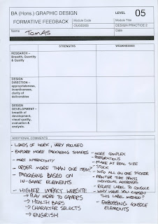
- Research is relevant and extremely focused.
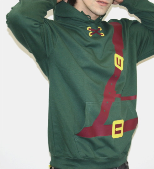
- Design development is extensive and coherent. The unified identity across the products are bold and the character 'costume' clothes would transfer well into physical products.
- Logo development is strong, the work produced is appropriate to the target market.
Weaknesses:
- More direct annotation on context blog to show how it relates to the work produced, need more reference to external influences, rather than relying soley on game-related ones.
- Not enough exploration into packaging
- Packaging should be scale, no specs
- Website is far too clinical for target audience

Question feedback, and open discussion
- Packaging: need to consider the size/scale of the boxes, the size of the order (if there is a larger quantity, how big will the box need to be) consider not just using the consoles, but based on in-game elements from the relative game. Embossing the console elements instead?
- Label/sticker: for posting out to people should have all information on it, maybe incorporating the in game elements onto it.
- Viral campaign: in-game jokes and simple imagery would work well, which could be sourced directly from the t-shirts
- Website: should look more like a gamers paradise, not clinical and uninteresting. Based on game screens, adorned with things like Engrish (poorly translated Japanese to English) and familiar game imagery
Action Plan
- Need to work on the website, the layout, navigation, and relative screens.
- Explore other methods of packaging, labelling and possible interactivity of the packaging.
- Make a physical product (t-shirt) and scale packaging
- Research game screens, download an emulator and take screenshots
Additional comments;
Pixellate the images for purchase, resolution increases when you click on the image
Sounds for purchase, or on site that are relative to the game.


No comments:
Post a Comment