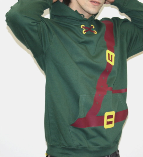


Just thought I would start messing around with the pre-site page, a bold statement of the company values and what the company does. Using the icons and the logo with minimal clutter looks ace.
The taglines based on the progress crit feedback are:
- 'Designed by nerds, for other nerds'
- 'Nerd clothing, made by nerds'
- 'Made for nerds, designed by nerds'


No comments:
Post a Comment